HOW I HELPED
- Website strategy
- UX Review
- Design UI
- Component development
- User flow
Improving Hampshire Flags UX design
My responsibilities included:
+ UX audit
+ UI system redevelopment
+ User workflow
+ Accessibility improvements
Toolkit
+ Figma
+ Figjam
+ Miro
+ Wordpress
Role
UX / UI Designer
The problem
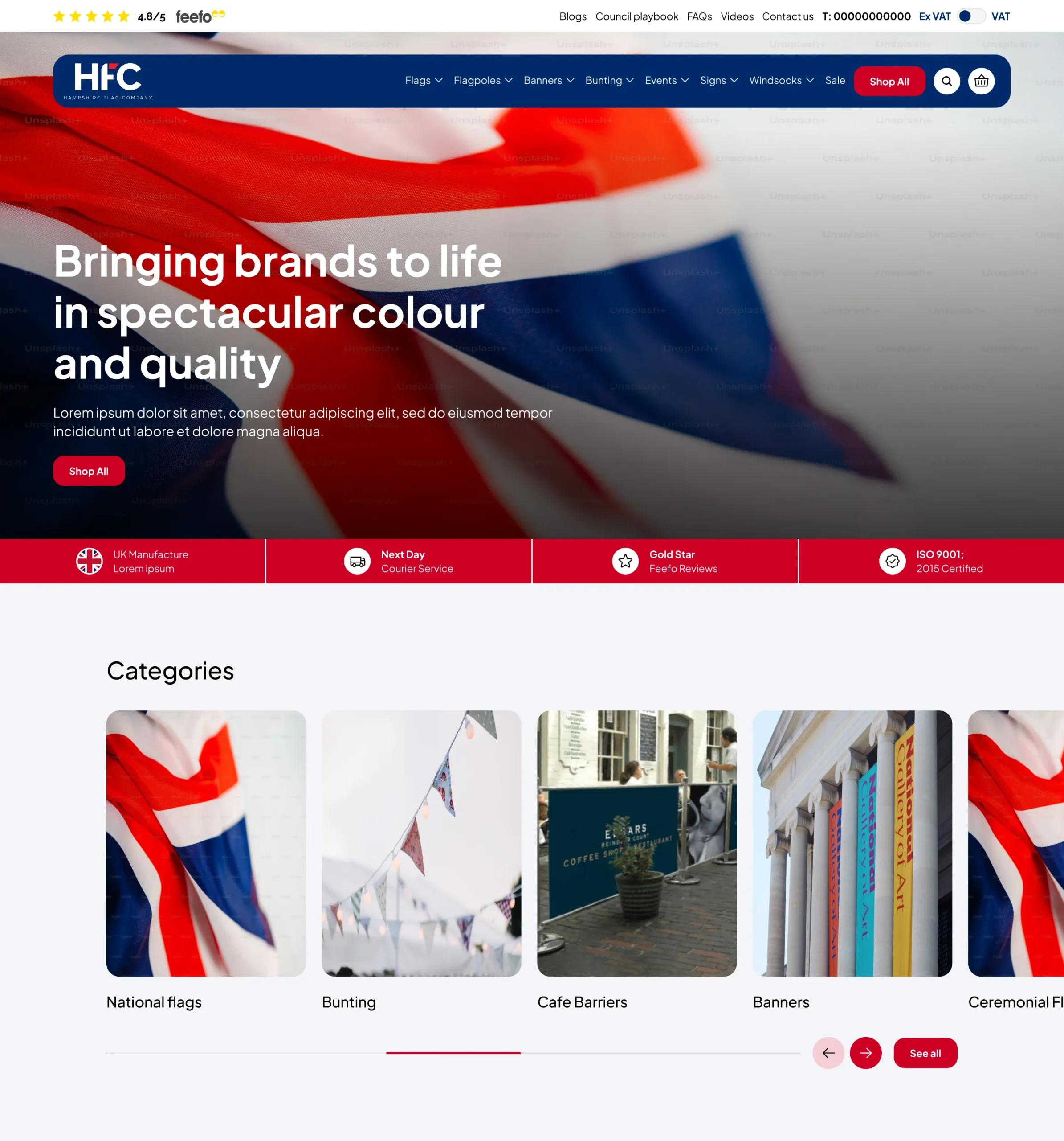
Over time, the Hampshire Flag website gradually became outdated, both visually and functionally, highlighting the need for comprehensive UX improvements. Evolving user expectations, changing design standards, and updated accessibility requirements made it clear that the site required a more modern, inclusive, and user-focused approach. In addition to visual refreshes, there was a strong need to improve overall usability and introduce features that better supported customer journeys from discovery to checkout.
Two of the primary focus areas were the navigation system and product cards. The navigation needed to become more intuitive and easier to explore, helping users quickly find relevant categories without feeling overwhelmed. Meanwhile, the product cards required improvements in both visual styling and information hierarchy. The previous designs took up excessive space and lacked clarity, making browsing less efficient. By refining layout, typography, spacing, and content structure, the updated designs aimed to create a cleaner, more scannable, and conversion-focused experience that aligned with modern UX best practices.
The Solution
Navigation was restructured to improve discoverability and reduce cognitive load. Categories were organised more logically, dropdowns were simplified, and clearer visual hierarchy was introduced to support faster browsing. The goal was to create a balance between search-led and browse-led user behaviour, ensuring both types of users could easily find what they needed.
Product cards were redesigned to be more compact, visually clean, and easier to scan. Excessive descriptive text was removed in favour of clearer titles, pricing, and supportive tag systems to highlight key attributes. Spacing, typography, and alignment were refined to improve readability, while ensuring the layout could scale effectively across devices.
Accessibility improvements were implemented through stronger colour contrast, consistent heading structures, improved button states, and clearer interactive elements. Together, these changes created a more modern, inclusive, and conversion-focused experience that aligns with current UX standards and supports Hampshire Flag’s continued growth.
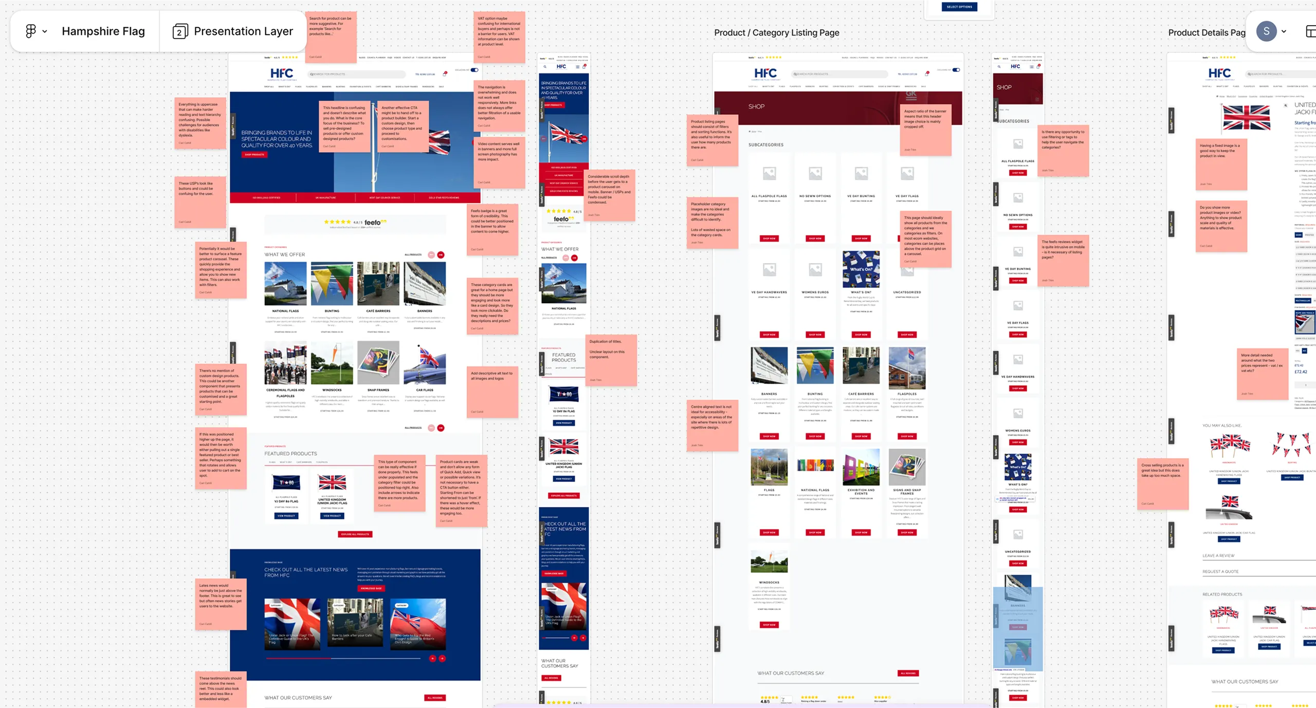
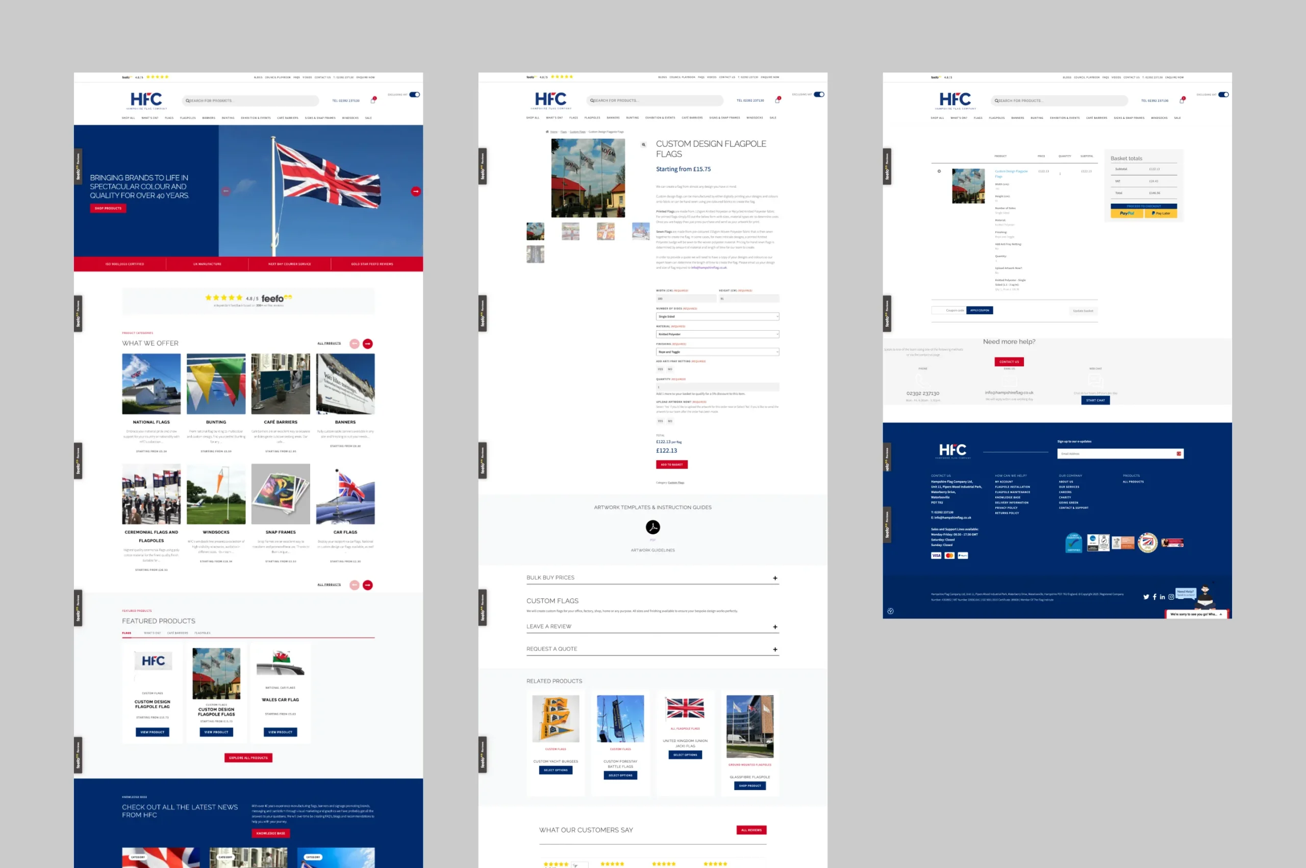
Extensive review of UX improvements to the existing site
The homepage, product category pages, individual product pages, and the checkout process was reviewed to identify friction points, improve navigation, and create a more seamless path to purchase. From refining content hierarchy and visual layout on the homepage, to improving product discovery on category pages, enhancing customisation and clarity on product pages, and streamlining the checkout experience, the goal was to deliver a more intuitive, efficient, and conversion-focused user experience across the entire site.
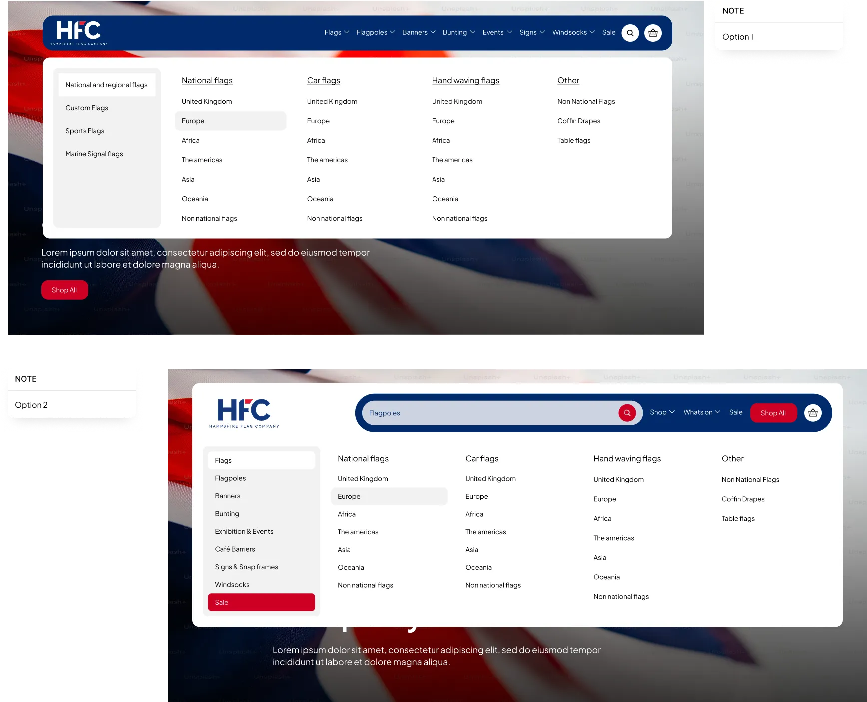
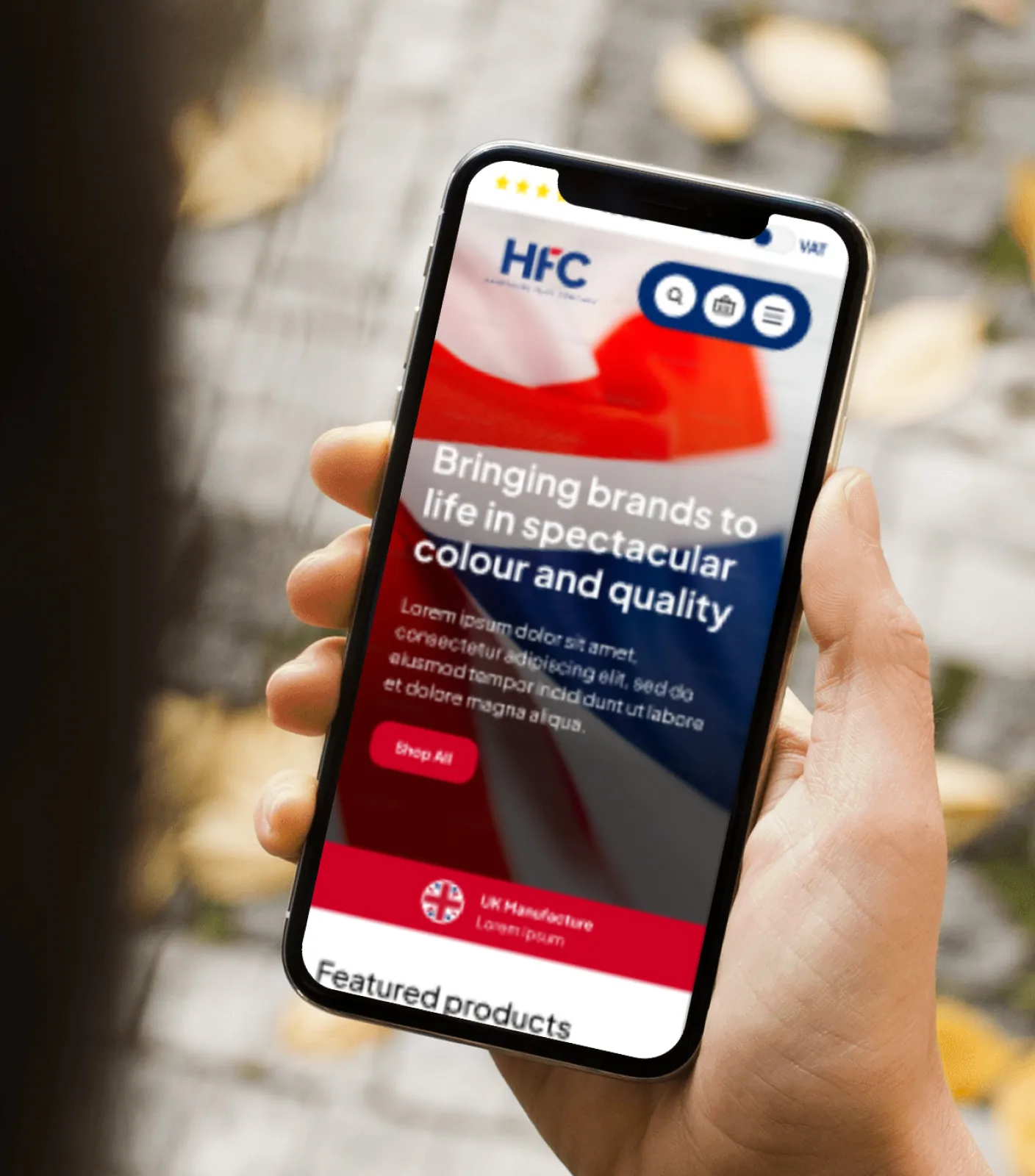
Navigation redesign
Because Hampshire Flag offers a wide range of categories and subcategories, the navigation bar needed to support easier category discovery. During the design process, I explored several approaches to make browsing more intuitive and user-friendly.
I introduced a more intuitive structure separating core product categories from utility links, reducing cognitive load and helping users find their destination faster.
- Clear top-level categories
- Logical submenus showing product families
- Persistent search support
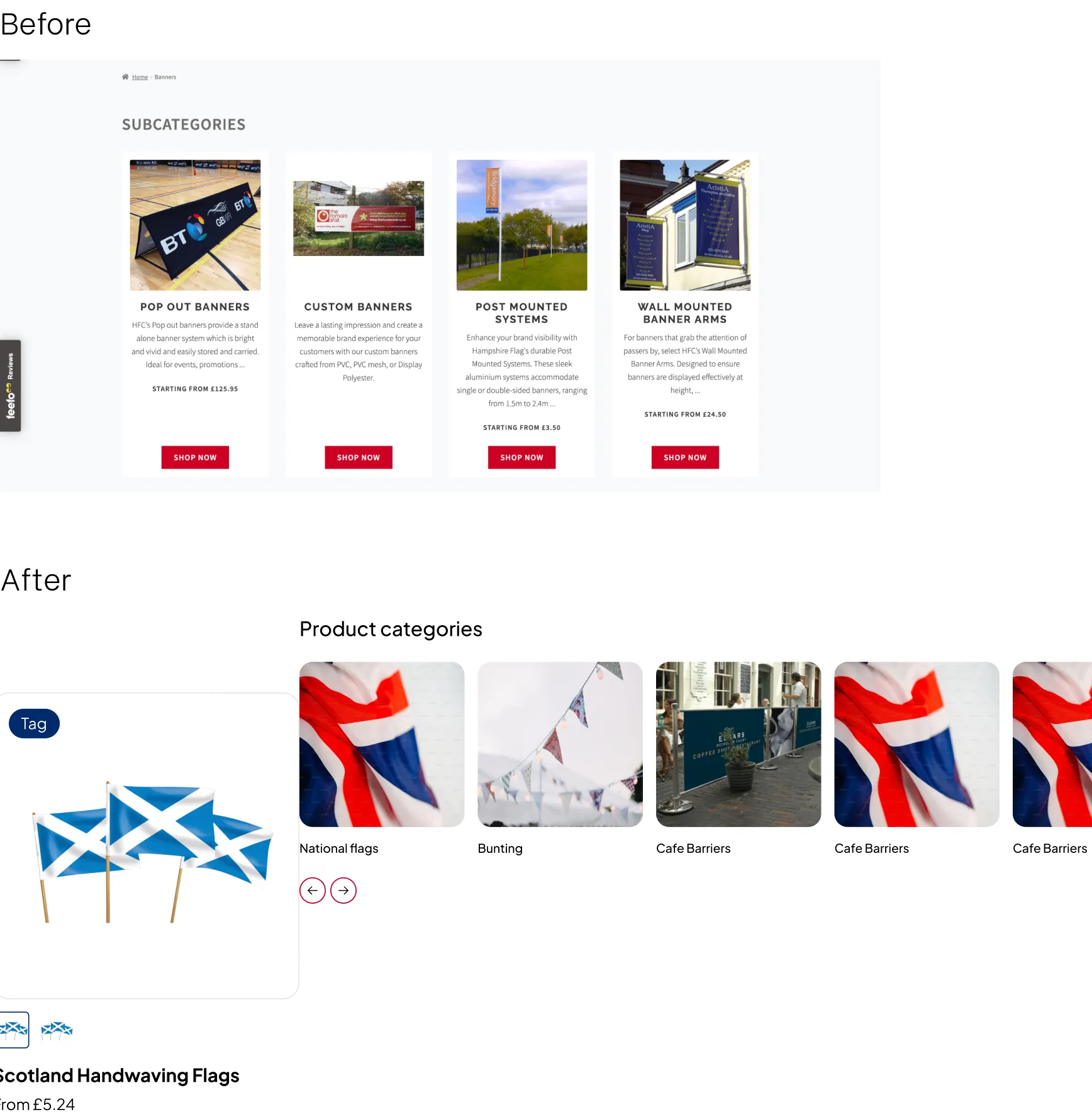
Product Card Standardisation
Another issue concerned the category and product cards. The existing designs were taking up far too much space on the main category pages, which negatively impacted usability and needed significant improvement.
To help this I created modular, consistent card templates that:
- Highlight key product information
- Use visual hierarchy to guide the eye
- Improve scanability across devices
- This established design consistency and reduced visual noise.
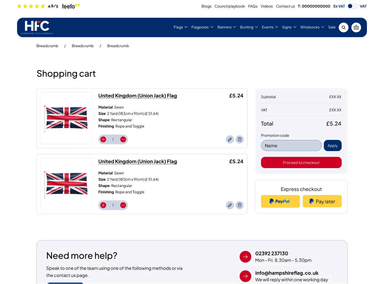
Condensing the basket page
The existing basket page, which displayed the selected customisations, occupied too much space and felt visually heavy. The redesign focused on making the layout more compact while simplifying how information was presented.
I aligned the updated design more closely with HFC’s branding and restructured the content into clearly separated sections. By giving each information block its own defined space, the page became easier to scan, more organised, and overall more user-friendly.
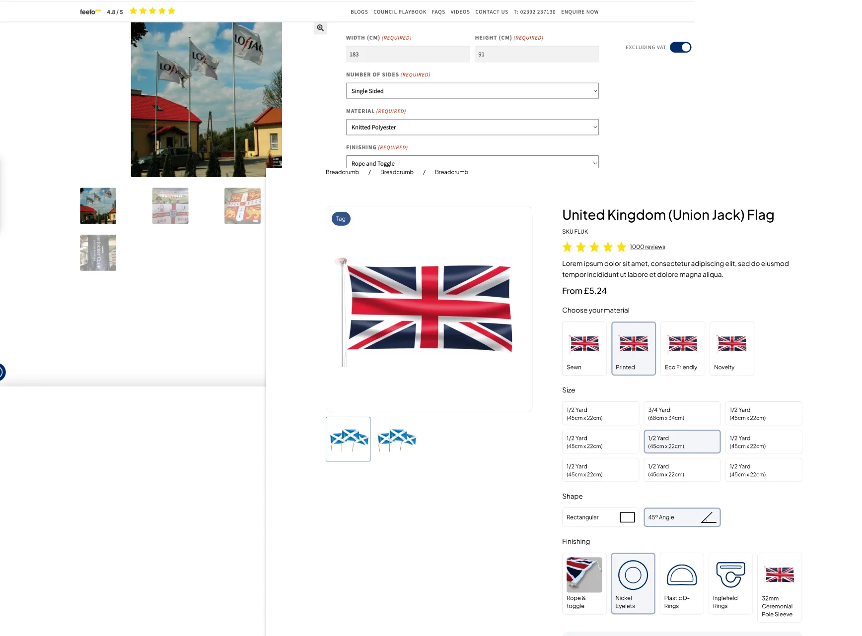
Enhanced Customisation UI
The previous design relied heavily on multiple dropdowns for customisation choices, which made the experience feel cluttered and overwhelming. During the redesign process, I researched how other companies approached extensive product customisation to identify more intuitive solutions.
As a result, I found that presenting options in a more visual format—supported by icons—made the selection process clearer and more engaging. I reworked the customisation flow so options are:
- Visually organised
- Clearly labelled
- Easy to preview and compare before adding to cart
- This streamlined the decision-making process and improved user confidence.
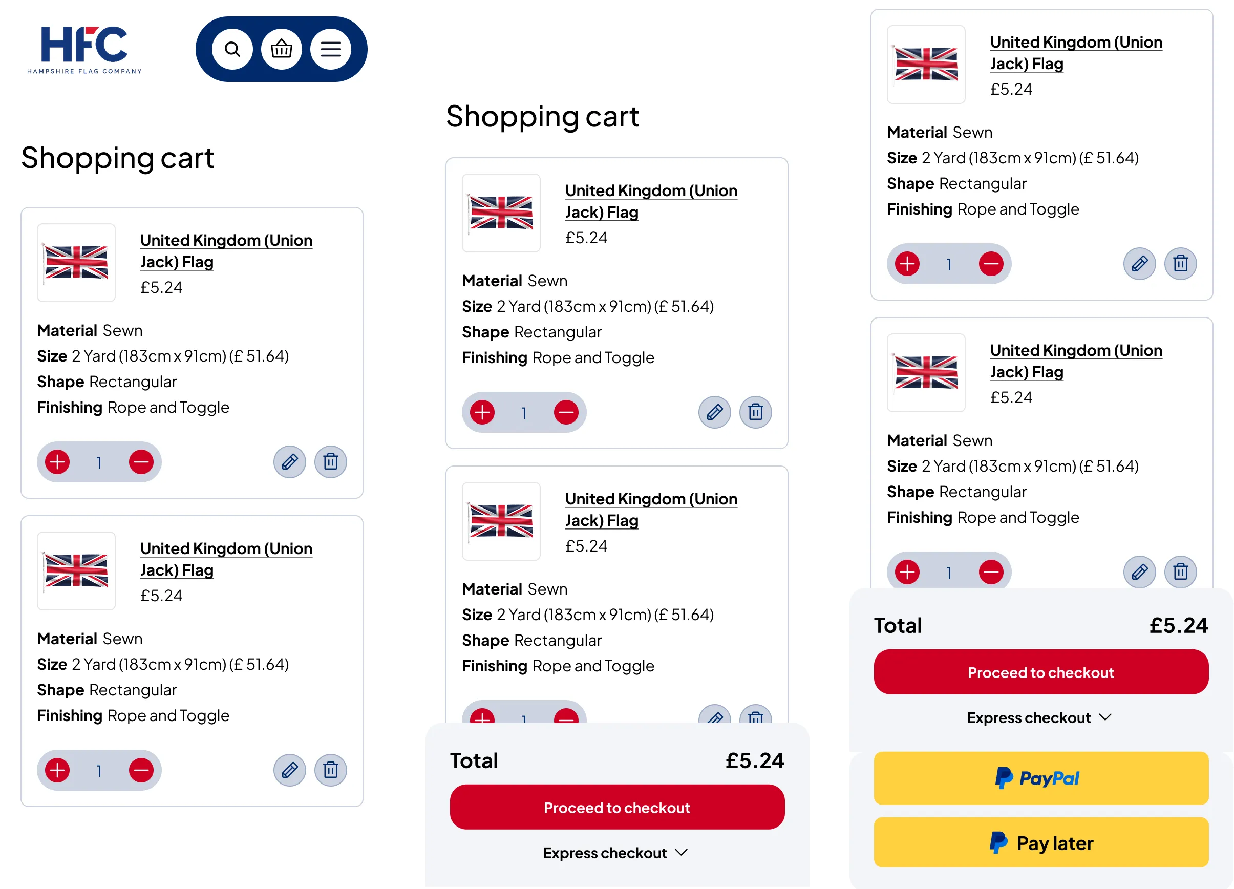
Mobile basket improvements
Introducing a sticky basket on scroll ensures that the checkout option remains accessible at all times, without requiring users to navigate back to the top of the page.
Before and After

Selected Works


REUKDigital

Beebu BroadbandDigital

Recruitment refreshDigital

Time etcWebsite design

KlindworthDigital
Holly&CoBranding & Website

Hygge MeBranding & Website
Music FestivalBranding & Website

Lone Wolf PTBranding & Website
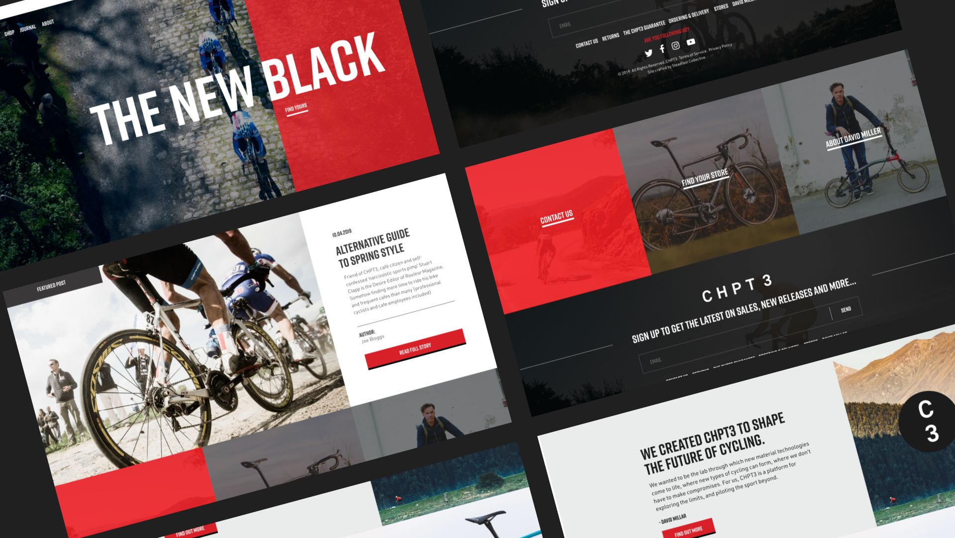
CHPT3Shopify website design
Other workRange

eBayWebsite design, Illustration

M3 ProductionsWebsite design
Work with me
Talk to me about your next project
©Sarahbonddesign 2026 Digital Website designer
PRIVACY POLICY | TERMS AND CONDITIONS