HOW I HELPED
- Website strategy
- Sitemap
- Wireframes
- Design UI
- Component development
BEEBU
A Faster, Smarter Broadband Experience Designed Around Real Users
TOOLS
- Figma
- FigJam
The problem
For an outdated broadband provider, the core UI/UX challenges stemmed from legacy systems and a lack of user-centered design. The customer-facing interfaces were cluttered, text-heavy, and built around internal business logic rather than user goals, making simple tasks like checking service status or upgrading plans unnecessarily difficult. Inconsistent navigation patterns across web and mobile platforms increased cognitive load, while slow load times and non-responsive layouts eroded user trust in an already fragile service experience. Limited accessibility considerations—such as poor contrast, small tap targets, and unclear error messaging—further excluded key user groups. These issues highlighted how outdated design decisions can directly amplify customer frustration and negatively impact brand perception in a highly competitive market.
Sitemap
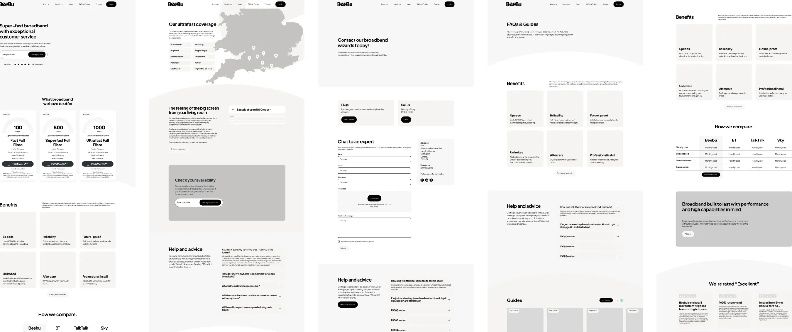
Wireframes were produced as a key stage in the design process to define the structure and user journeys of the broadband website before moving into visual design. They focused on layout, content hierarchy, and functionality, ensuring that key actions such as postcode lookup, package comparison, and availability checks were clear and easy to access. By stripping back visual detail, the wireframes allowed early testing and discussion around usability and flow, helping to align stakeholders and resolve potential issues before progressing to high-fidelity designs.
Exploring homepage options
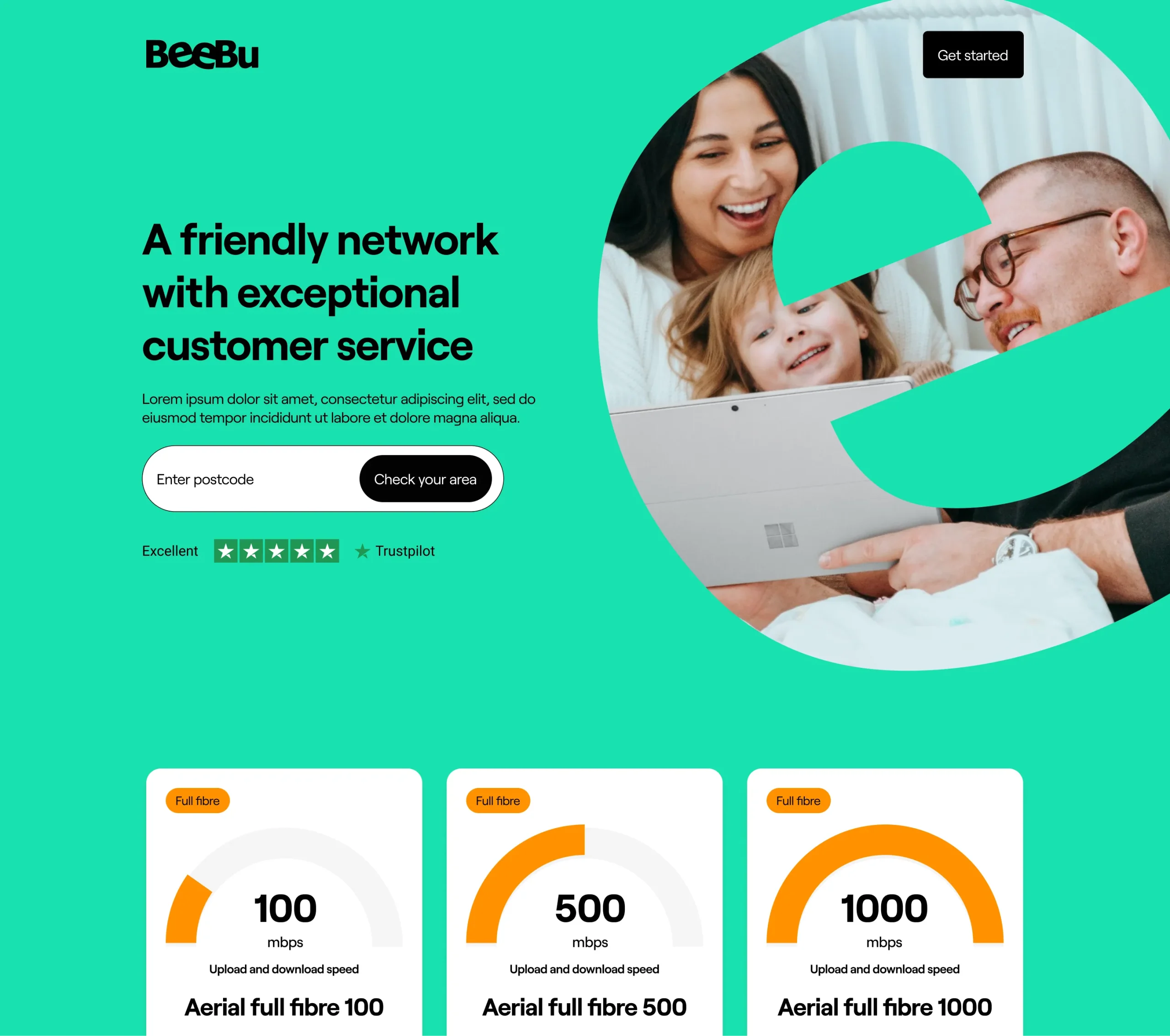
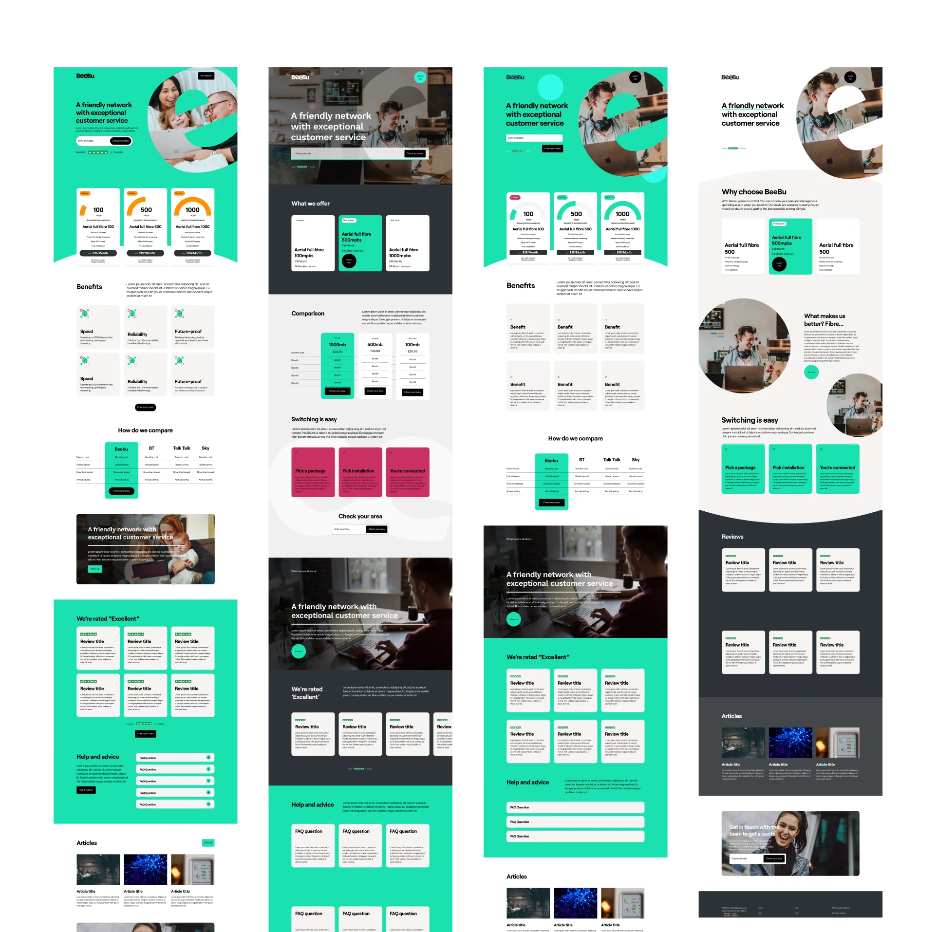
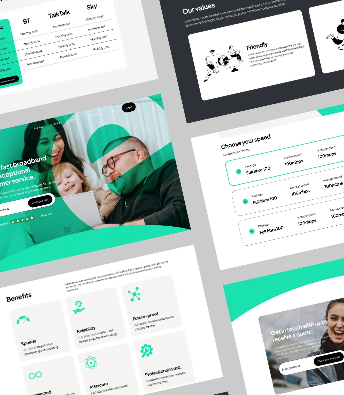
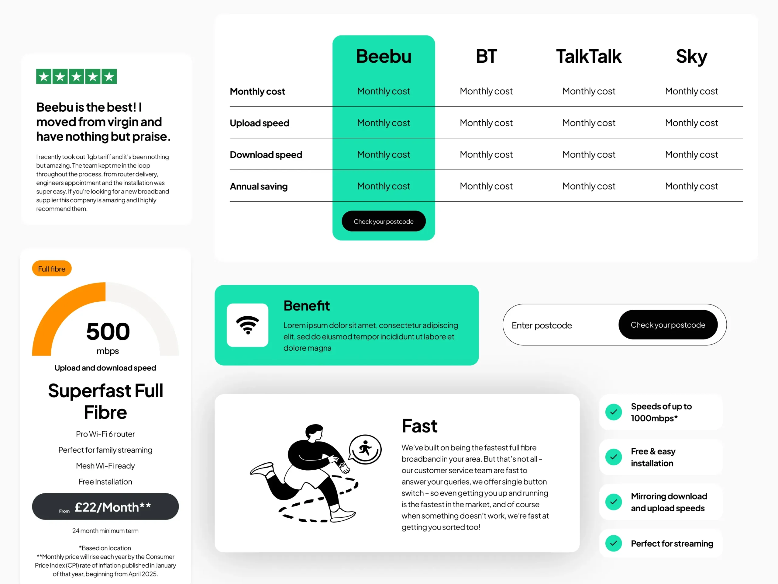
During the design phase, extensive exploration was carried out across multiple homepage concepts, with selected directions presented to the client for feedback and refinement. Each concept was developed with a strong and deliberate hierarchy of information, ensuring users could easily scan, understand, and engage with key content.
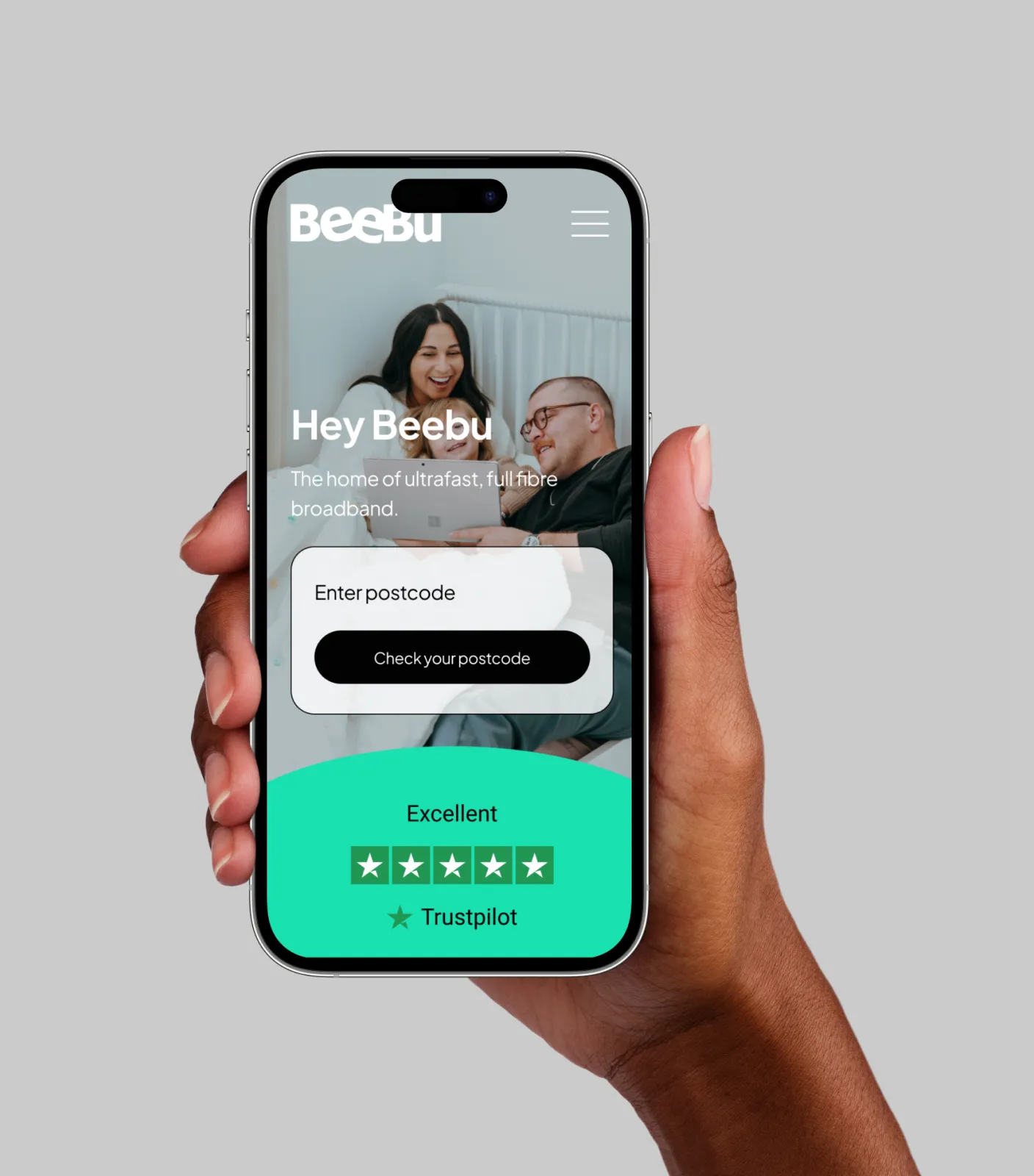
A primary focus was placed on making the postcode search box highly visible and immediately prominent on first visit, as this represented the main entry point to the user journey and a critical business goal. In addition, strong client testimonials were strategically incorporated into the homepage to reinforce credibility, showcase the strength of the company’s customer base, and build trust with new users from the outset.
Easier searching for broadband
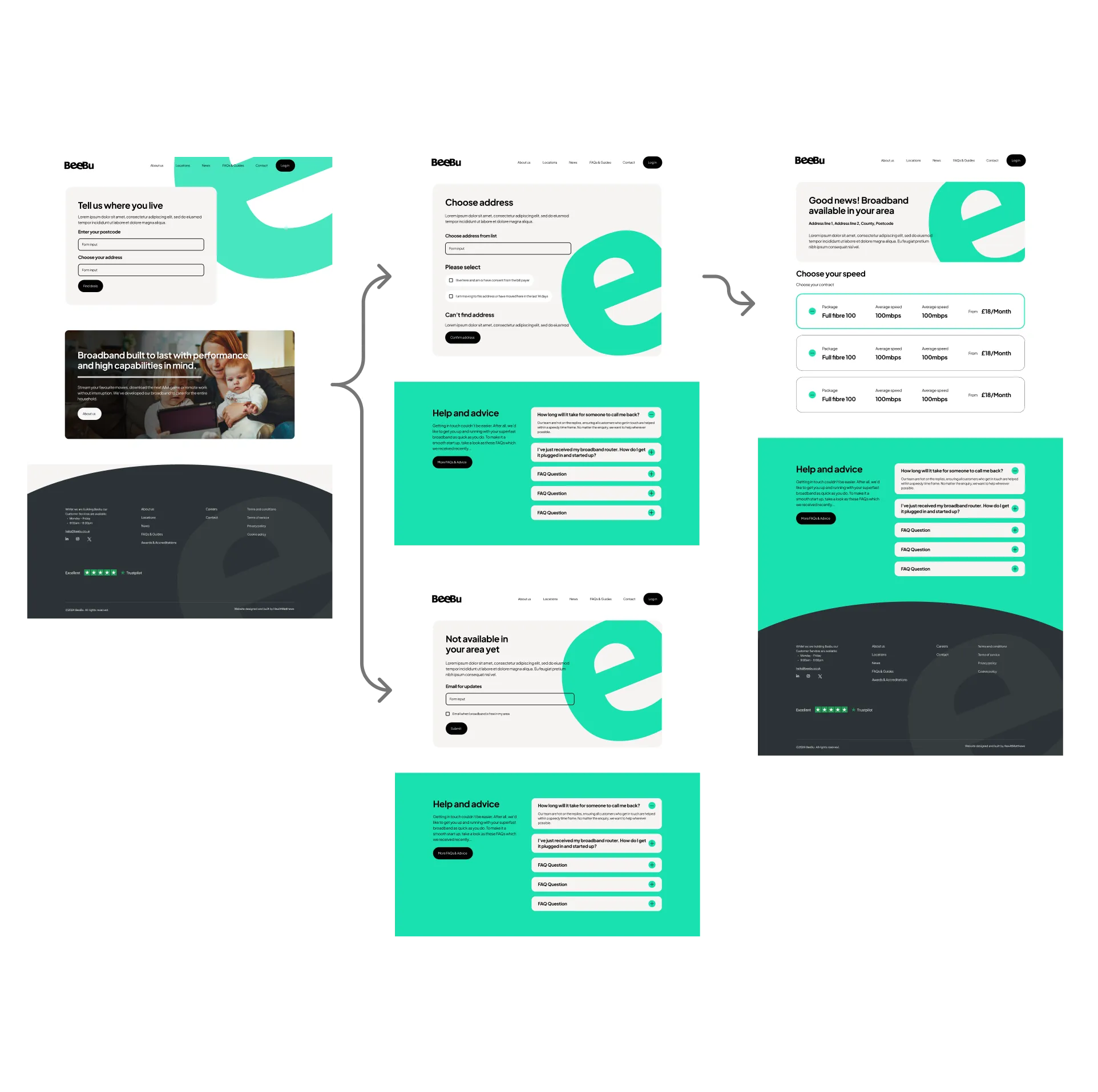
An improved and simplified approach was introduced to make finding suitable broadband packages faster and more intuitive. Users can now enter their postcode to instantly view available addresses and check broadband availability within their area. This location-based flow removes unnecessary steps and uncertainty, allowing users to quickly understand what services are accessible to them. Based on the selected address, the site presents personalised broadband packages tailored to that specific location, ensuring users are only shown relevant options and creating a more efficient, user-focused experience ideal for a modern digital journey.
Design and UI
Simplifed information
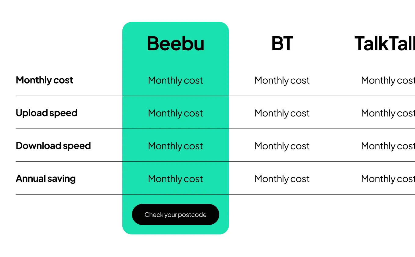
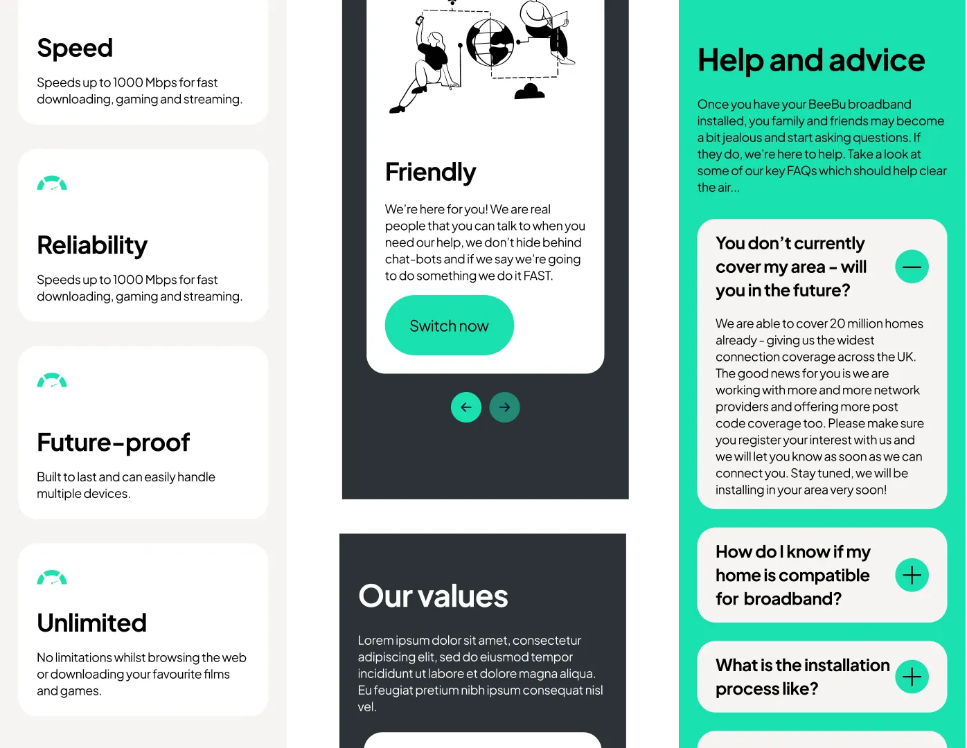
New UI components were designed to present richer visual information in a clear and structured way, making content easier for users to scan and understand. By improving layout, hierarchy, and visual cues, these components allow users to quickly gather key details without feeling overwhelmed. This approach enhances usability compared to the existing website, supporting faster decision-making and a more intuitive overall experience.
Mobile optimised
All design components were carefully optimised to work effectively and efficiently on mobile devices. This included the use of readable font sizes, clear spacing, and responsive layouts to ensure content remains easy to read on smaller screens. Interactive elements were designed to be touch-friendly and accessible, allowing all users to navigate, interact with components, and complete key actions comfortably and confidently on mobile devices.
Overcoming a dilemma
During the design process, it became clear that the map visual used to represent the company’s coverage would need to scale effectively as the business continues to grow. As additional locations are added, the existing approach risked becoming cluttered and visually disjointed, reducing both clarity and usability. To address this, the visual was revisited with scalability in mind, ensuring it could evolve alongside the company without compromising the user experience.
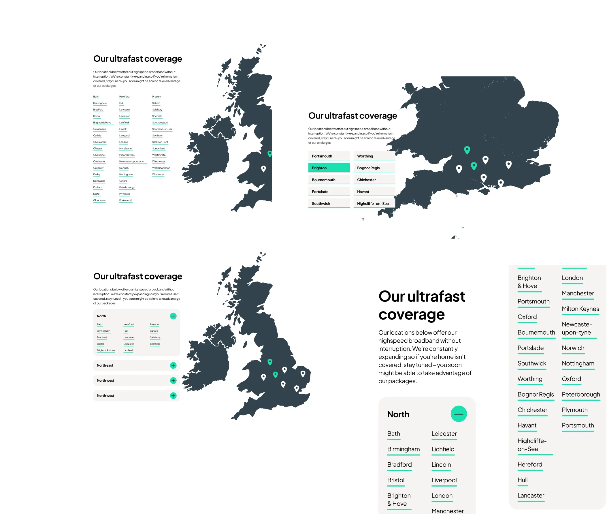

The fix
Through testing and exploration of different approaches, segmenting locations by UK counties proved to be the most effective solution. This method keeps the design clean and organised while also making it quicker and easier for users to locate specific areas, striking a balance between visual clarity and functional efficiency.
Selected Works


REUKDigital

HFC UX improvementsDigital


Recruitment refreshDigital

Time etcWebsite design

KlindworthDigital
Holly&CoBranding & Website

Hygge MeBranding & Website
Music FestivalBranding & Website

Lone Wolf PTBranding & Website
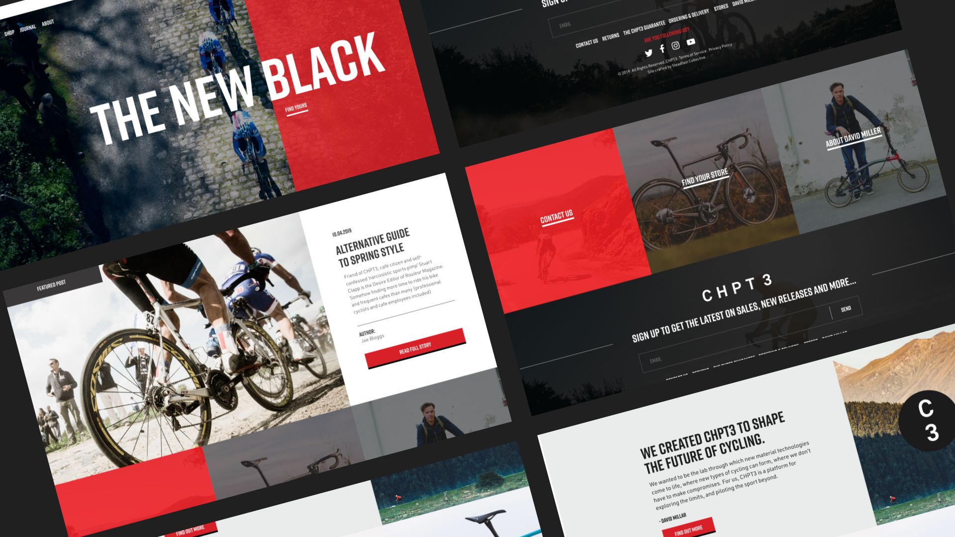
CHPT3Shopify website design
Other workRange

eBayWebsite design, Illustration

M3 ProductionsWebsite design
Work with me
Talk to me about your next project
©Sarahbonddesign 2026 Digital Website designer
PRIVACY POLICY | TERMS AND CONDITIONS