HOW I HELPED
- Website strategy
- Sitemap
- Wireframes
- Design UI
- Component development
ABR Recruitment
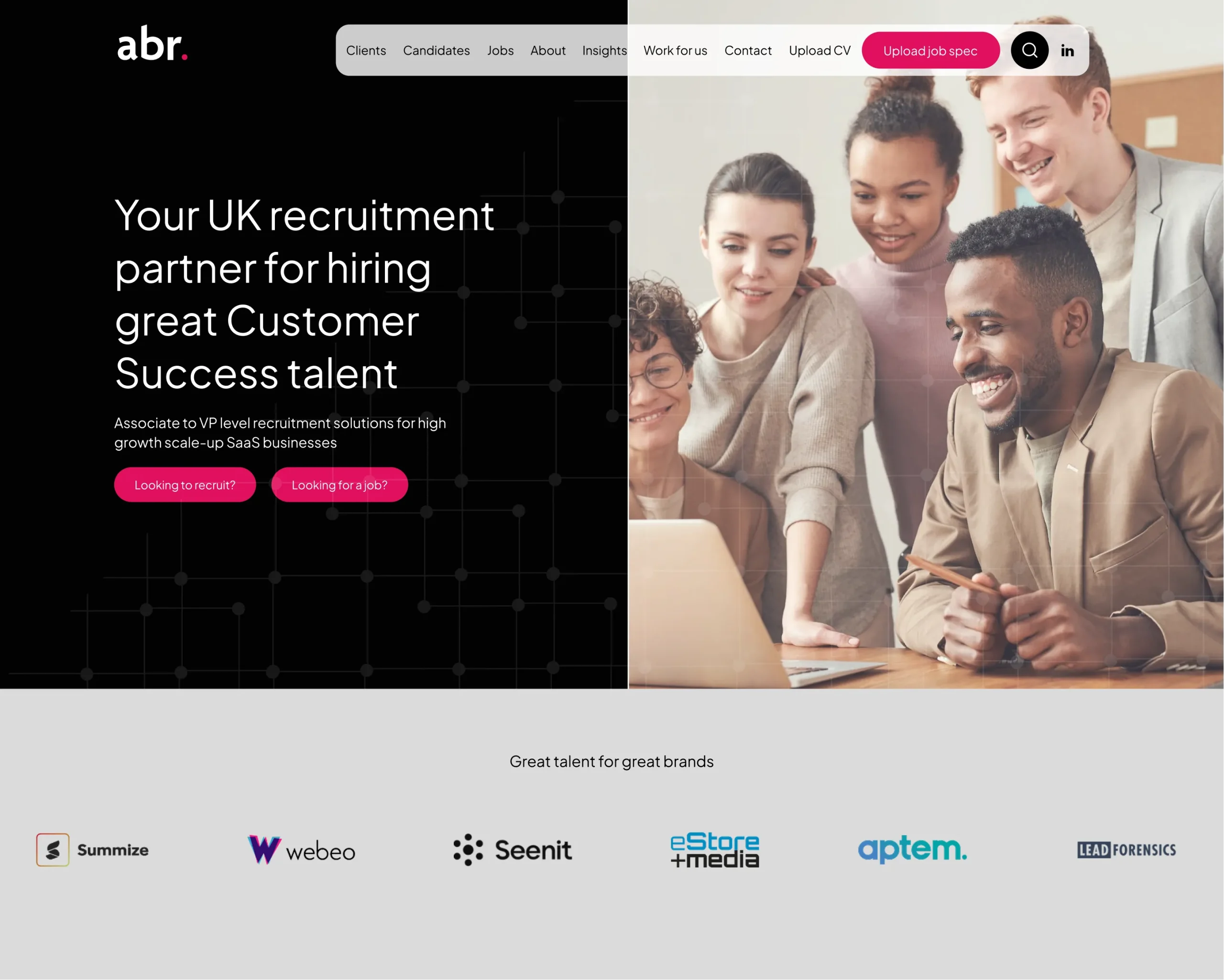
Bringing recruitment into the modern age
TOOLS
- Figma
- FigJam
The problem
As part of the discovery phase for the ABR recruitment website, a number of key challenges were identified that highlighted clear opportunities for improvement. Users were struggling to find relevant roles quickly, with limited filtering by sector, location, or contract type often leading to frustration and drop-offs. Navigation and information architecture lacked clarity, making job discovery inefficient, while an outdated visual design reduced trust and failed to resonate with candidates in a competitive market. Additional issues included low application conversion rates caused by lengthy or unclear application flows, limited mobile optimisation for users searching on the go, and poorly defined journeys for candidates versus employers. These insights helped shape the direction of the project, reinforcing the need for clearer pathways, improved UX, and a more engaging, modern recruitment experience.
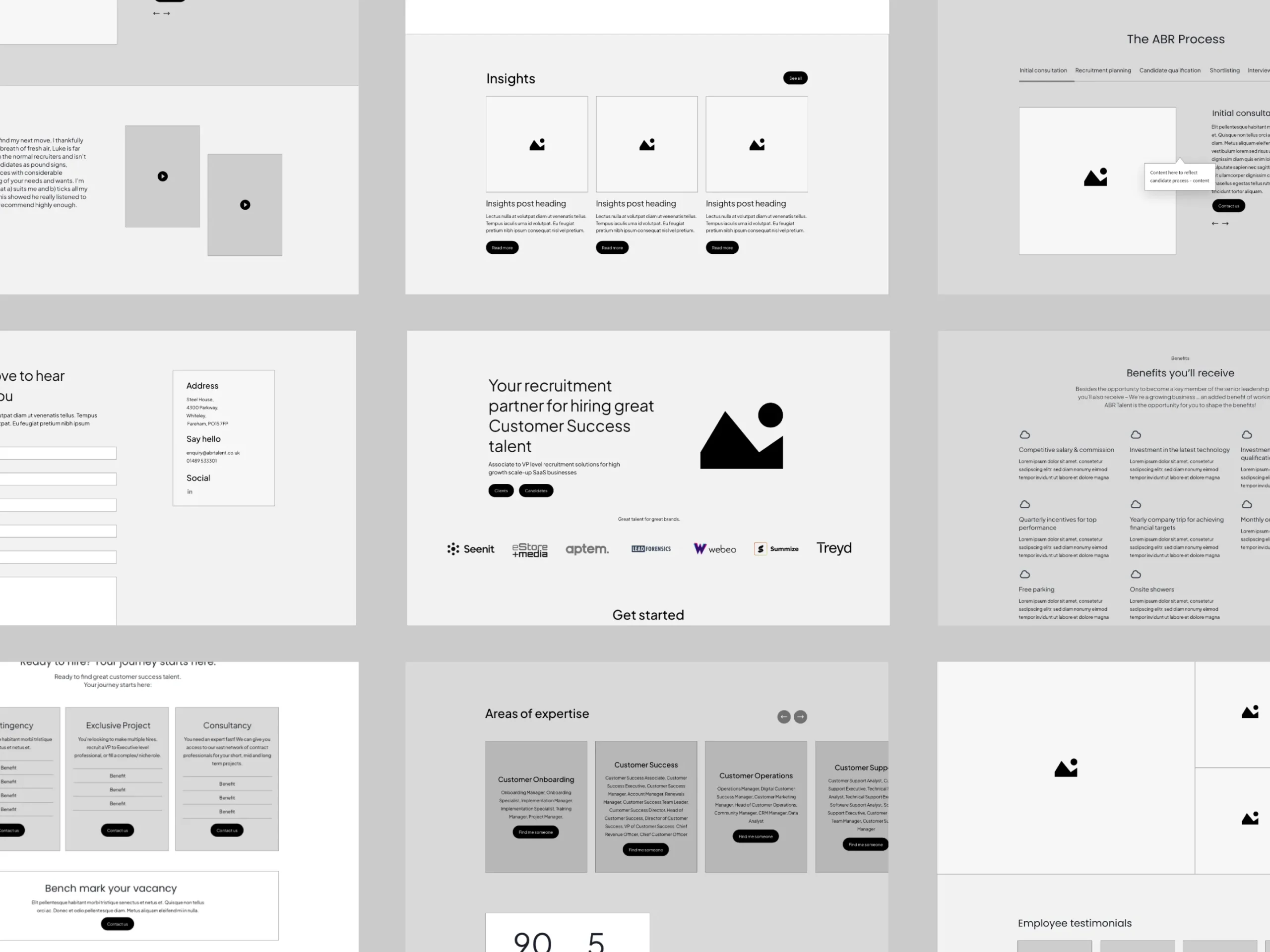
Initial wireframes
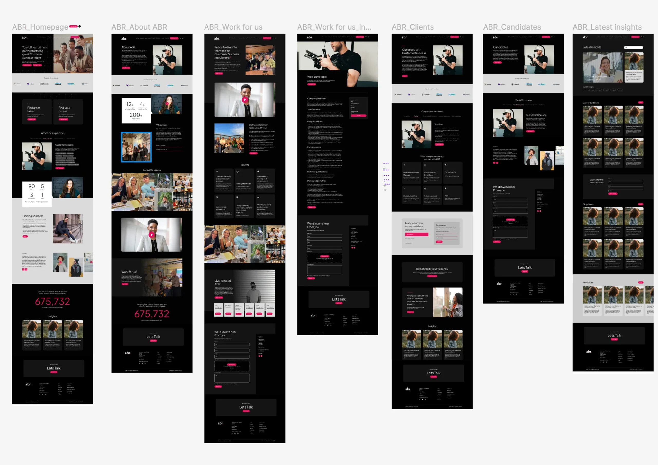
Wireframes were produced as a key stage in the design process to define the structure and user journeys of the broadband website before moving into visual design. They focused on layout, content hierarchy, and functionality, ensuring that key actions such as postcode lookup, package comparison, and availability checks were clear and easy to access. By stripping back visual detail, the wireframes allowed early testing and discussion around usability and flow, helping to align stakeholders and resolve potential issues before progressing to high-fidelity designs.
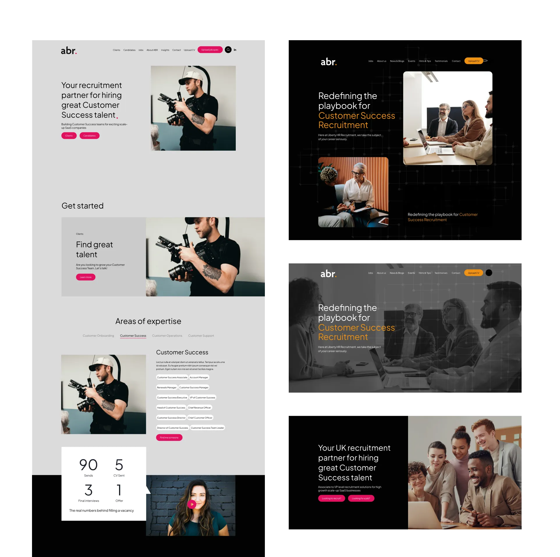
Exploring homepage options
The homepage design process began with the creation of multiple concept directions, each exploring different layouts, messaging priorities, and visual approaches aligned to the project goals. These initial concepts were designed to test hierarchy, user flow, and key calls to action, allowing stakeholders to compare strategic approaches rather than just visual styles.
Once a preferred direction was selected, it was refined and developed further—enhancing detail, strengthening components, and resolving usability considerations—before progressing into high-fidelity design. This iterative approach ensured the final homepage was not only visually strong, but strategically aligned and performance-driven.
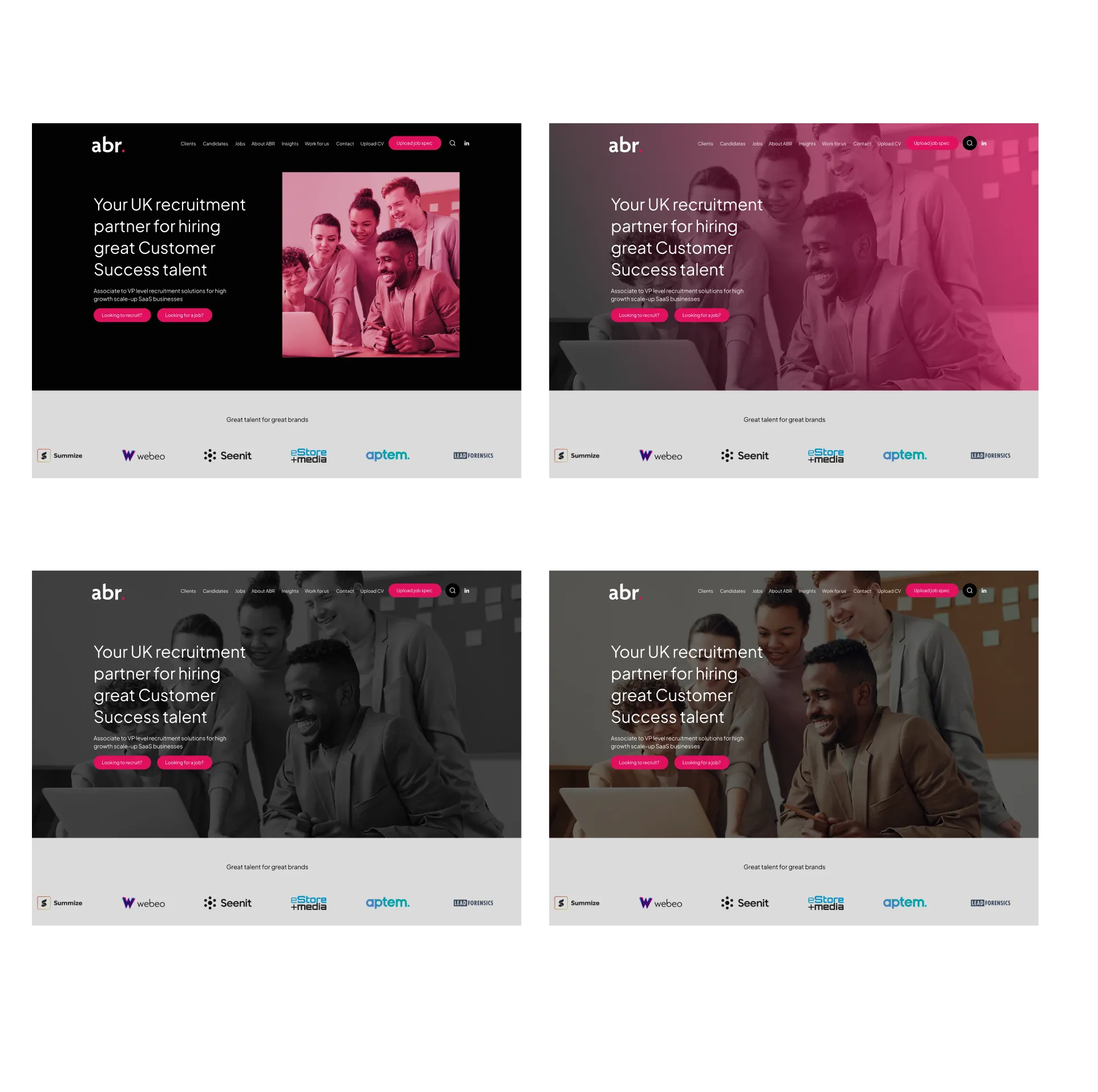
Exploring different hero options
After the initial hero design failed to perform as expected, further exploration was undertaken to test alternative design approaches. Multiple variations were created, experimenting with layout, messaging, visual emphasis, and calls to action to better capture user attention and support key goals.
This iterative process allowed insights from performance and feedback to directly inform design decisions, ultimately leading to a stronger hero section that more clearly communicated value, improved engagement, and better guided users into the main journey of the site.
Design and UI
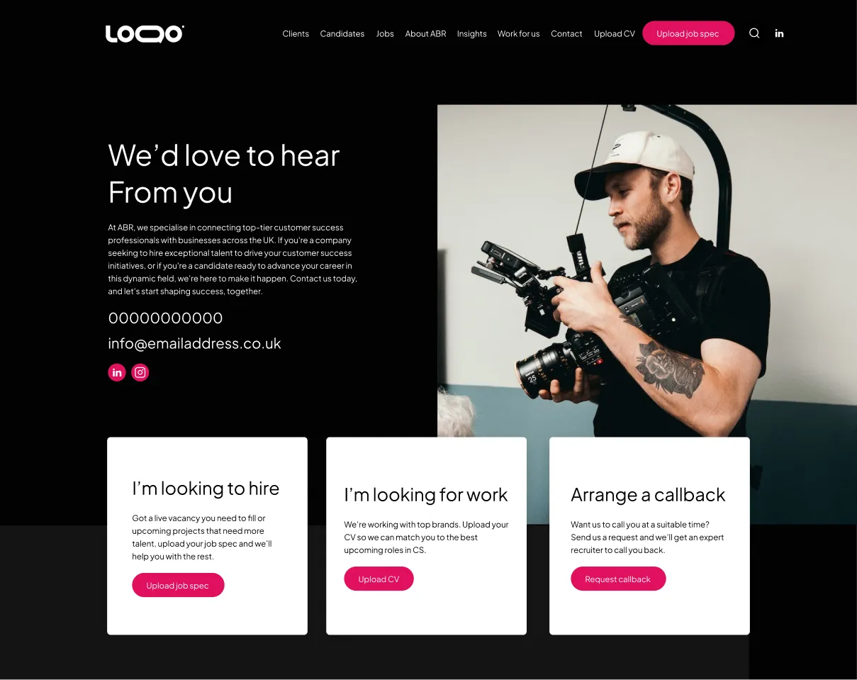
Clear contact signposting
By separating enquiries for different audiences—such as clients, recruiters, or callback—users can quickly identify the correct pathway without confusion or unnecessary steps. This approach reduces friction, improves form completion rates, and ensures enquiries reach the appropriate teams, making it a strong UX solution that benefits both users and the business.
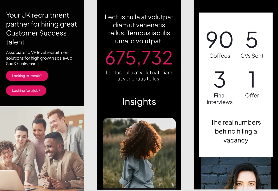
Mobile optimised
All design components were carefully optimised to work effectively and efficiently on mobile devices. This included the use of readable font sizes, clear spacing, and responsive layouts to ensure content remains easy to read on smaller screens. Interactive elements were designed to be touch-friendly and accessible, allowing all users to navigate, interact with components, and complete key actions comfortably and confidently on mobile devices.
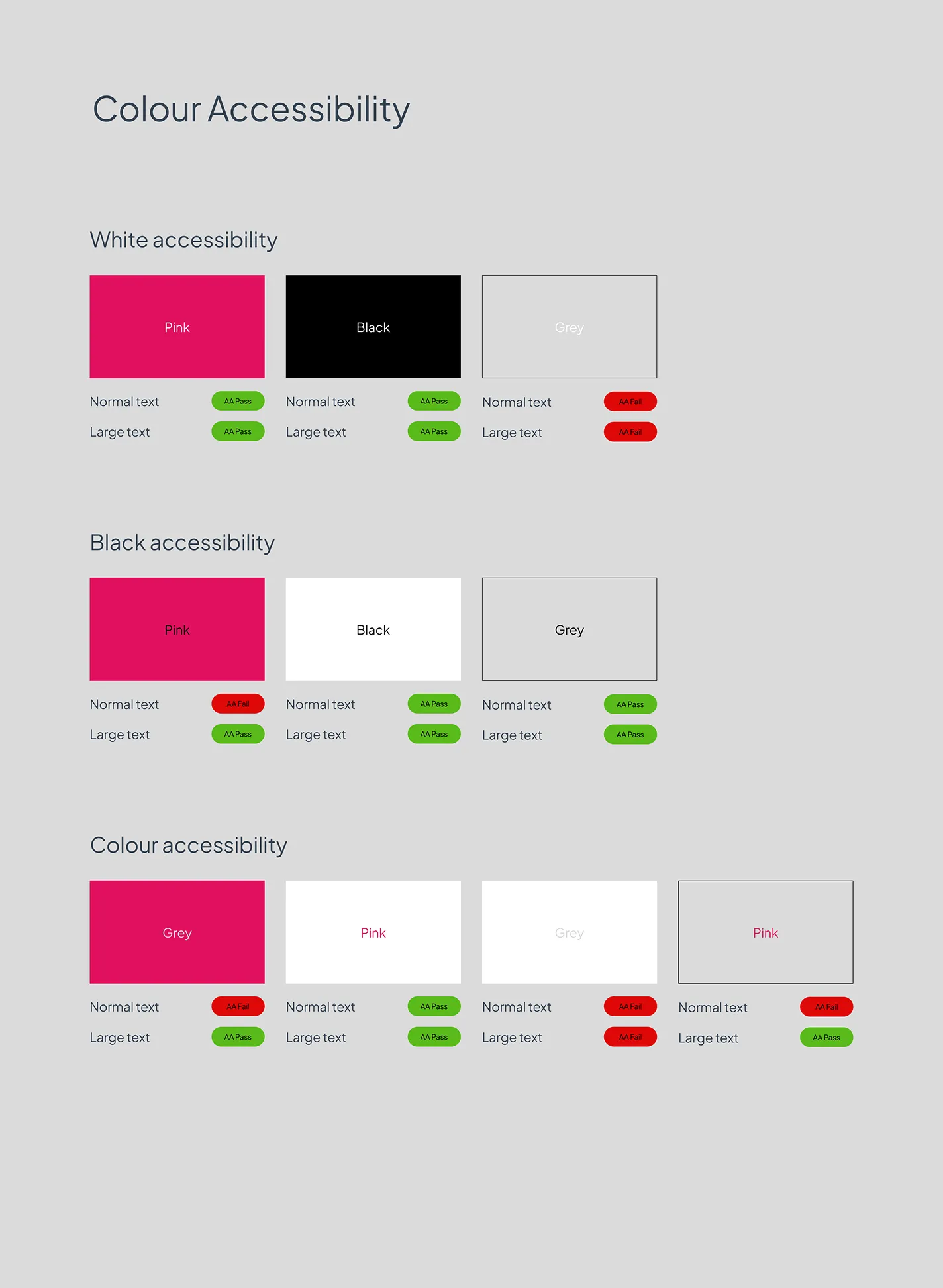
Components
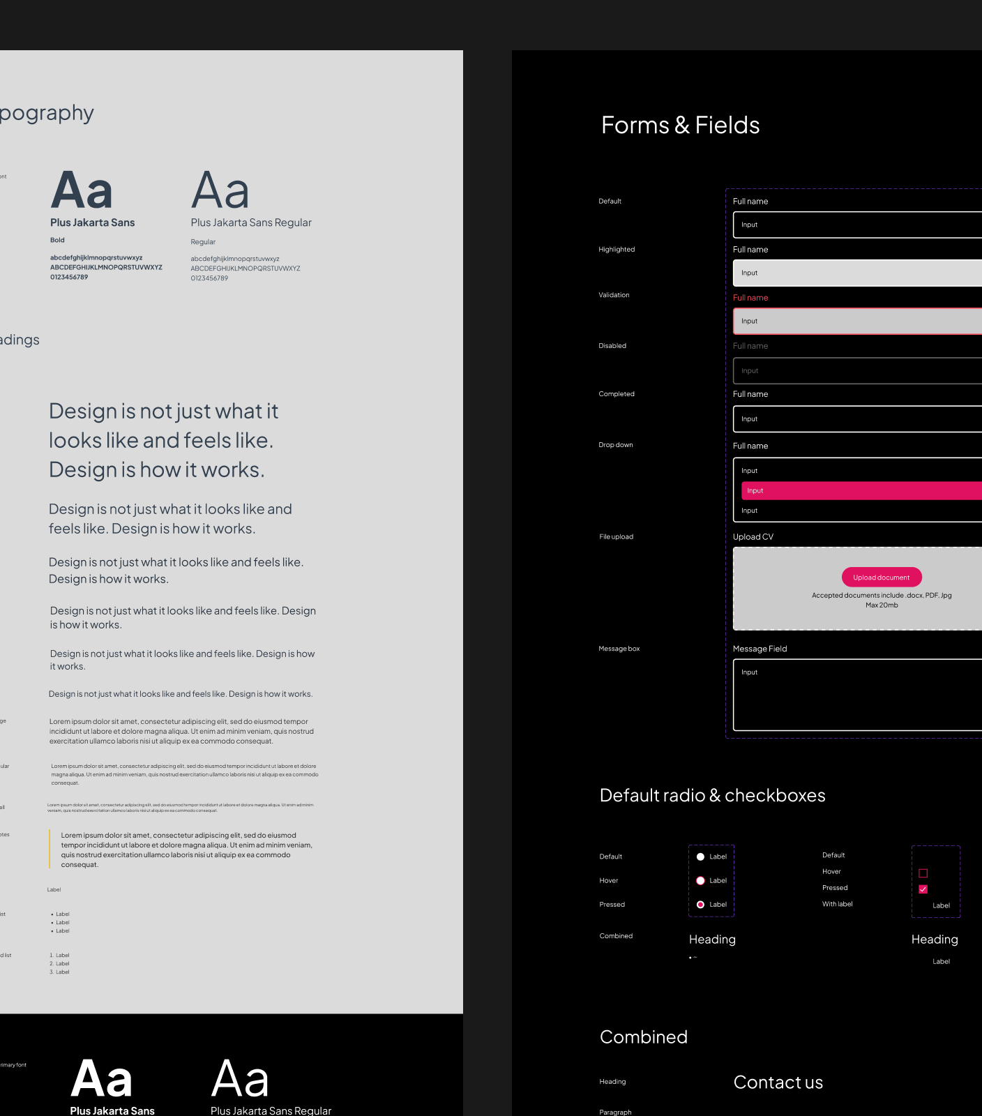
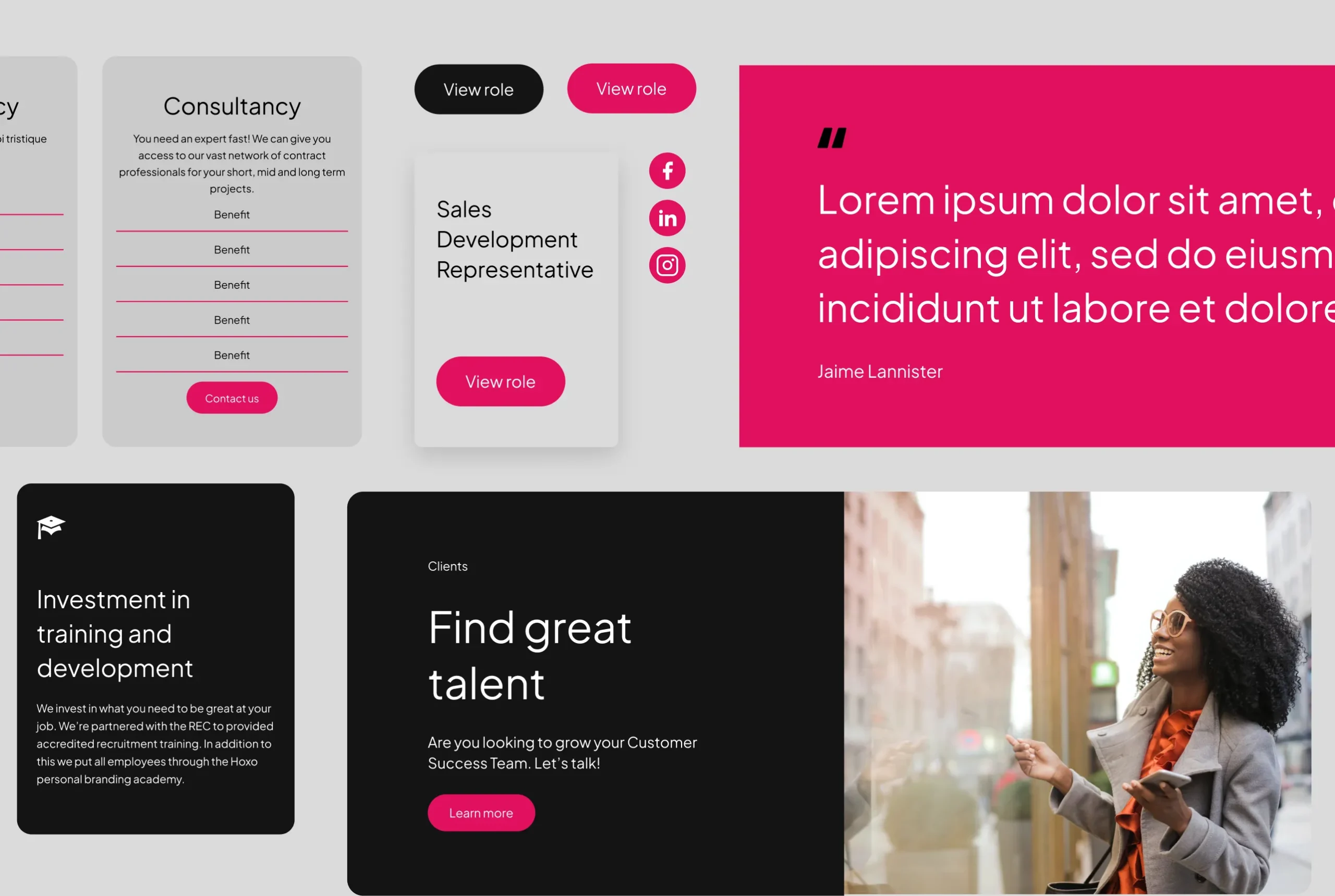
Individually designed components were created to form the building blocks of the overall website experience. Each component was thoughtfully developed with usability, consistency, and scalability in mind, ensuring it could function independently while also integrating seamlessly within the wider design system. By breaking the site into modular segments—such as cards, banners, content blocks, and interactive elements—the design became more flexible and easier to maintain. This component-based approach not only improved visual consistency across pages but also streamlined development and allowed for future growth and iteration.
Selected Works

DewhurstDigital
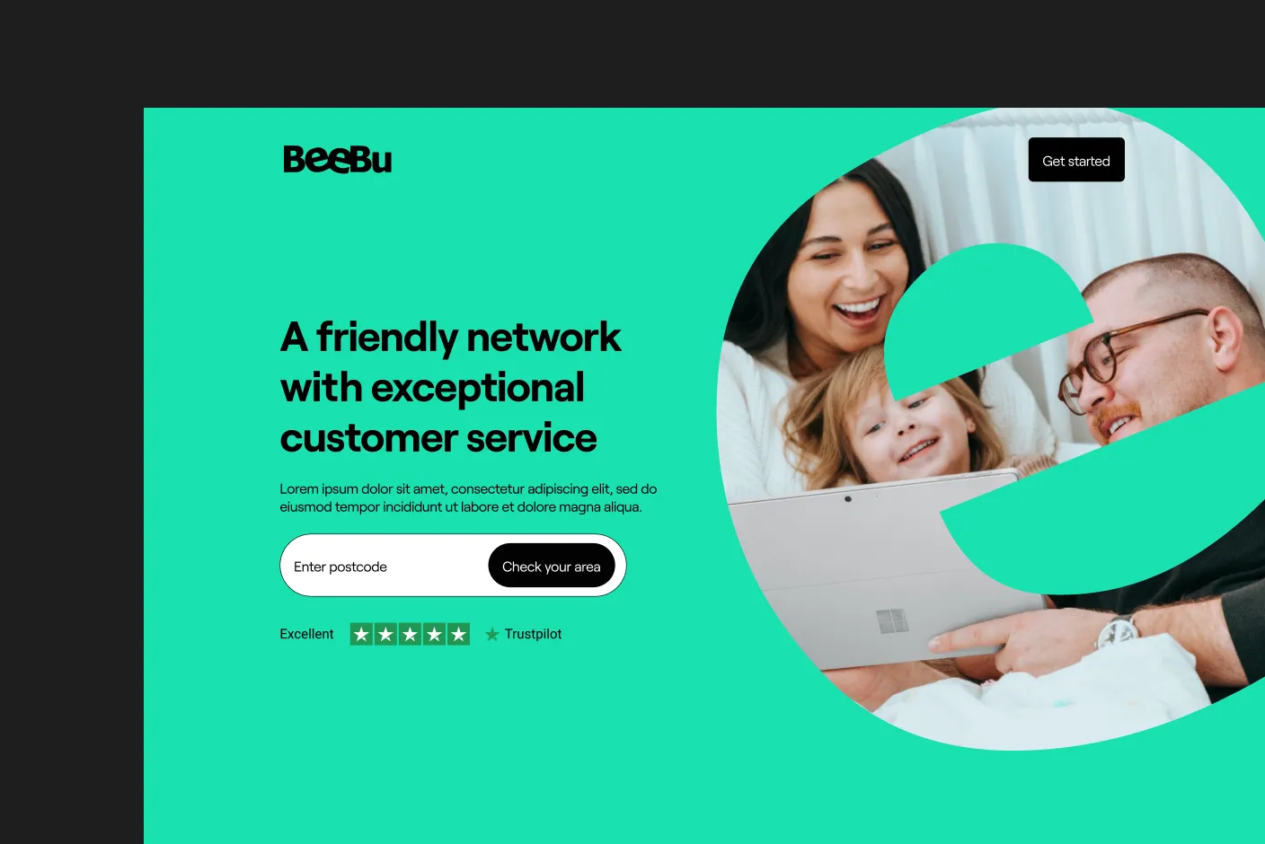
Beebu BroadbandDigital

P&O Cruises CareersDigital

Time etcWebsite design

KlindworthDigital

Toucan DiversityWebsite, Mobile, Design system
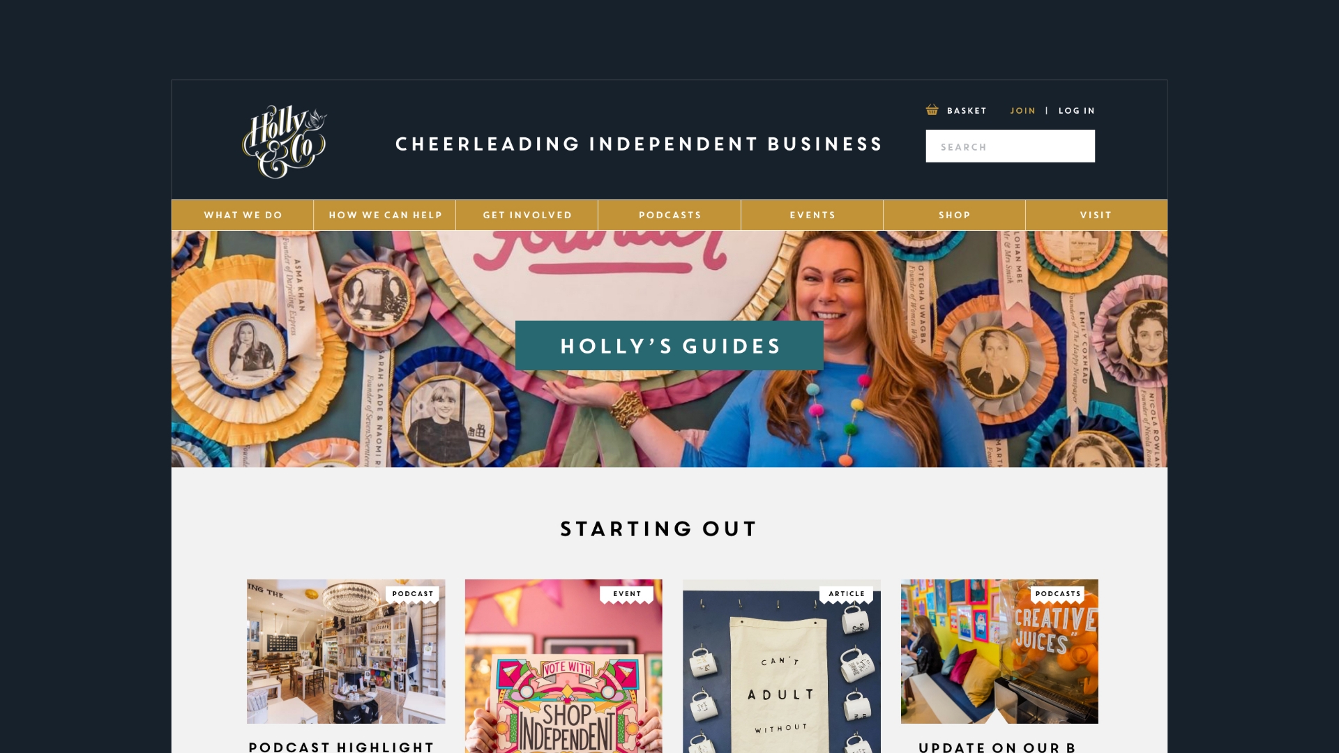
Holly&CoBranding & Website

Hygge MeBranding & Website
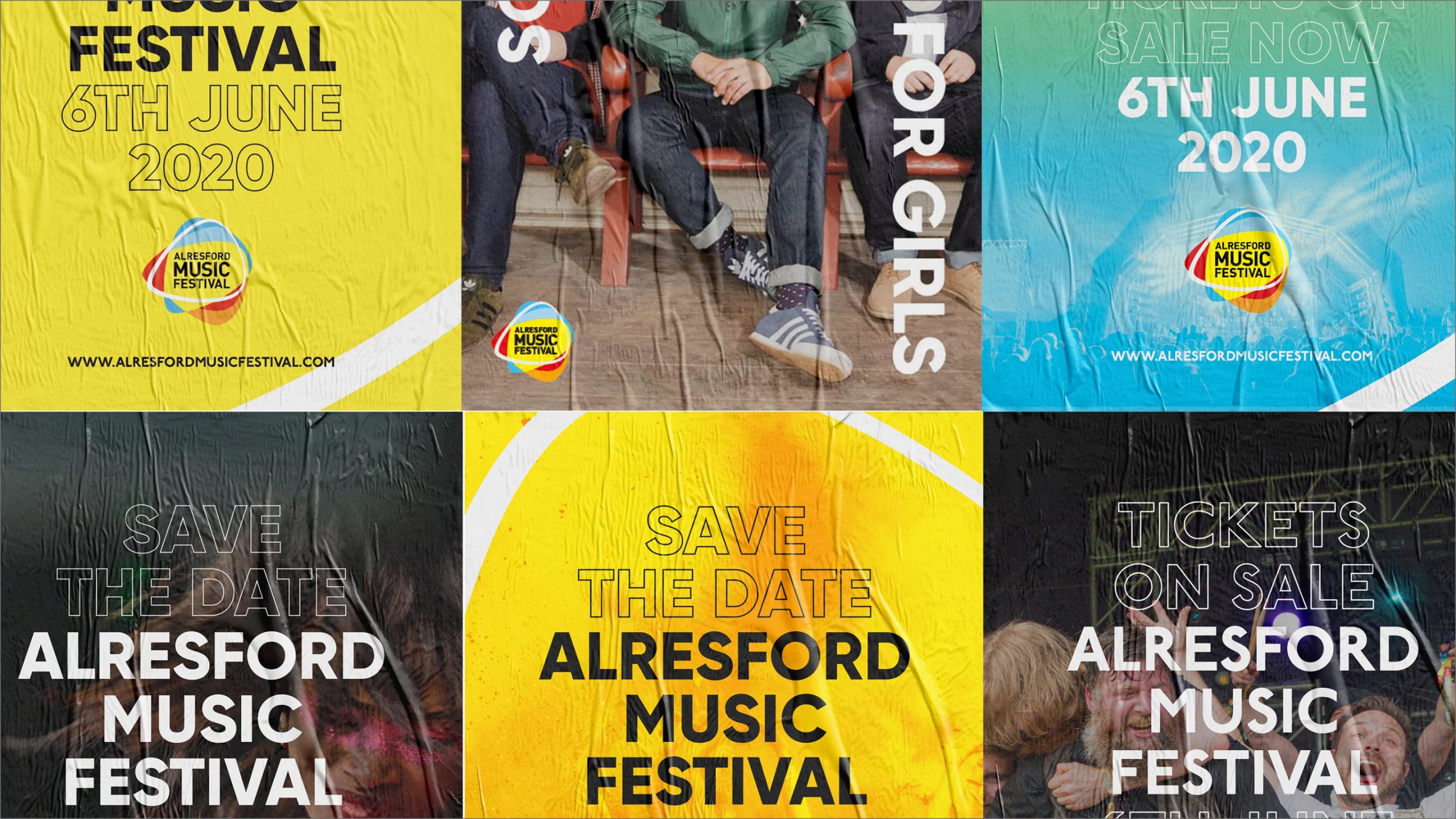
Music FestivalBranding & Website

Lone Wolf PTBranding & Website
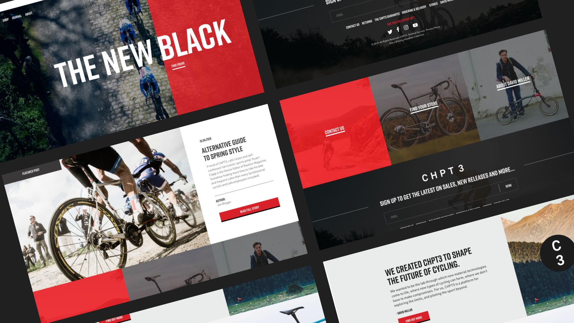
CHPT3Shopify website design
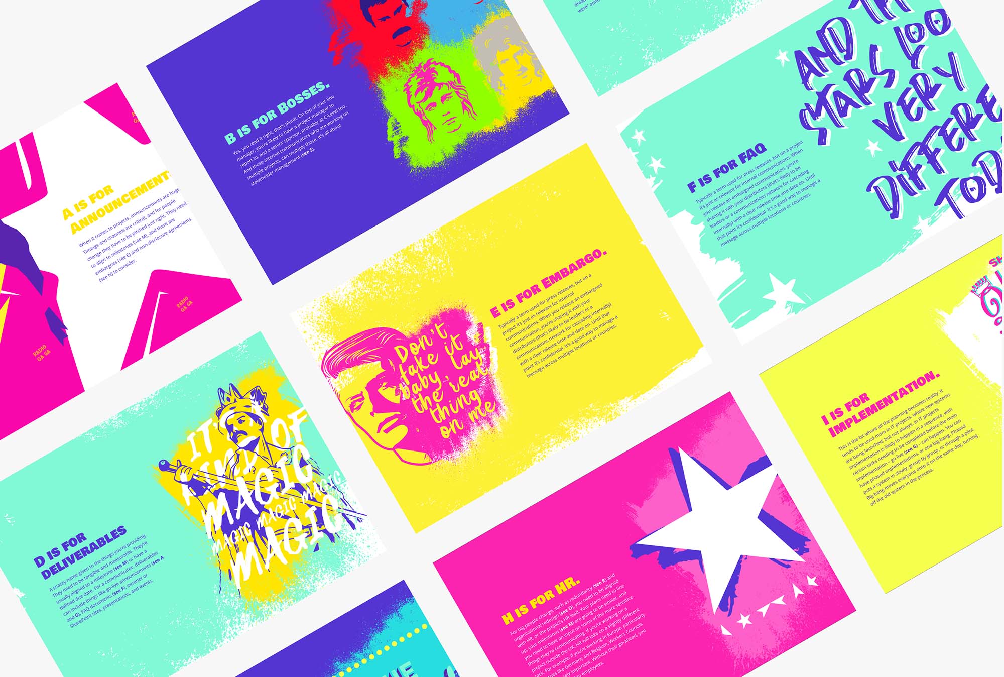
Other workRange

eBayWebsite design, Illustration

M3 ProductionsWebsite design
When you find the designer that
captures beauty exactly the way you wanT
Email: Sarah@sarahbonddesign.co.uk
Twitter: @sarahbonddesign
Insta: @sarahbonddesign
© Sarahbonddesign 2024 Digital Website designer
PRIVACY POLICY | TERMS AND CONDITIONS